
Talking About the Stock Market (3) - How to Read MACD?
MACD is almost the default panel in many trading apps: lines plus red/green bars. It looks complicated, but the essence is simple: compare the asset to itself. Here is a plain-language walkthrough.
1. The Three Components of MACD
In a MACD panel you typically see two lines and a histogram:
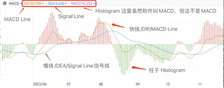
- Fast line (often orange): the MACD line, also called DIF/DIFF. This is the core.
- Slow line (often blue): the signal line (often labeled DEA). This is an average of the fast line and helps identify signals.
- Histogram: the difference between the MACD line and the signal line. Since the signal line is typically a 9-day average of the MACD line, the histogram can be loosely thought of as the change of momentum (you can hand-wavily treat it as a second derivative of price).
Common misconception: some apps label the histogram as "MACD". But the key is the fast line; the slow line and histogram are helpers.
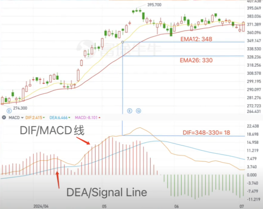
2. What MACD Is Actually Comparing
MACD is essentially the difference between a short-period EMA and a long-period EMA. Defaults are often 12-day EMA minus 26-day EMA. You can change parameters (e.g., 5 vs 10), but 12/26/9 is a historically popular choice by Gerald Appel to balance sensitivity and stability.
Think of it like comparing a student's recent average score with their long-term average:
- recent average > long-term average → MACD line > 0 → improving
- recent average < long-term average → MACD line < 0 → weakening
But direction also matters:
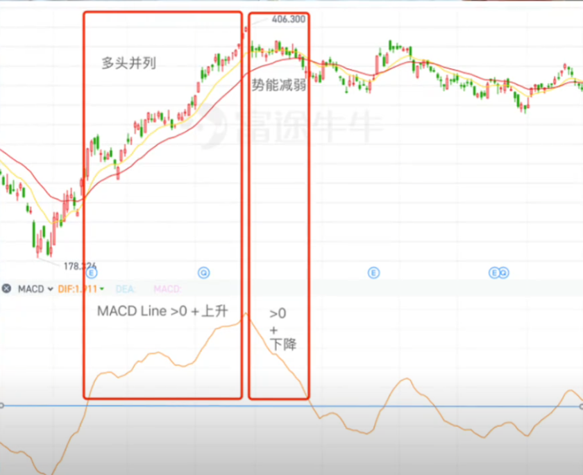
- MACD > 0 and rising: bullish momentum strengthening
- MACD > 0 but falling: bullish momentum weakening; possible top forming
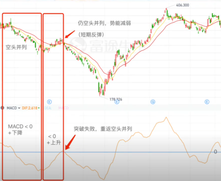
- MACD < 0 and falling: bearish momentum strengthening
- MACD < 0 but rising: bearish momentum weakening; potential bottoming
3. Practical Use: Crossovers and Pitfalls
In practice, MACD helps with three things:
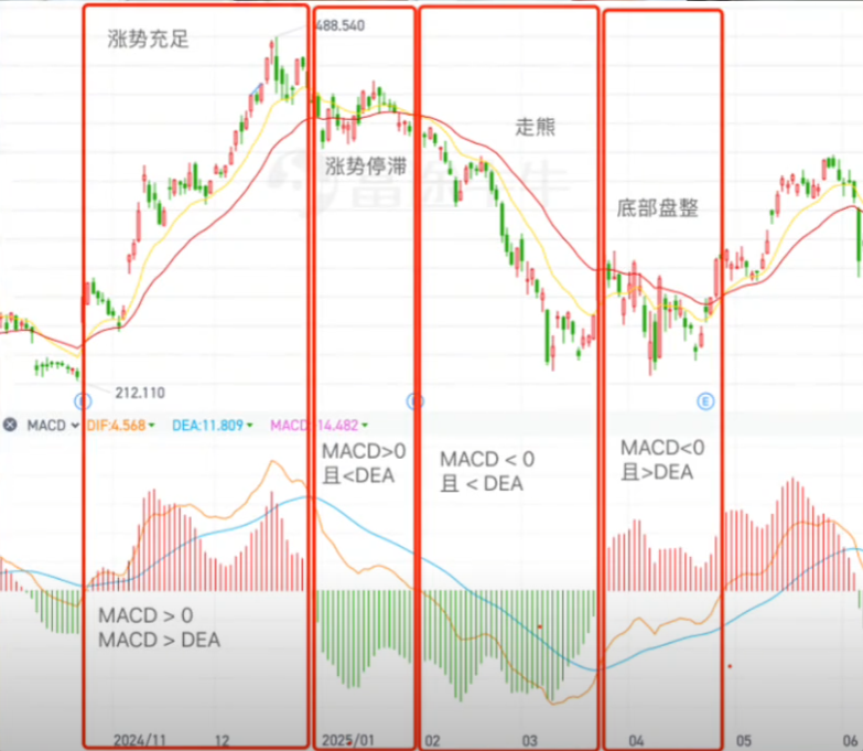
1) Trend direction
- MACD line > 0: uptrend (bullish)
- MACD line < 0: downtrend (bearish)
2) Momentum
Histogram bars growing suggests momentum strengthening; shrinking suggests weakening. You can also watch the distance between the two lines.
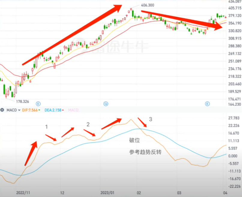
3) Potential reversal points (golden cross / death cross)
- Golden cross: MACD line crosses above signal line → momentum strengthening
- Death cross: MACD line crosses below signal line → momentum weakening
Closing
When I first entered markets, MACD helped me avoid some detours—at least it taught me what to look at and what to wait for. Over time I realized its big weakness: in ranging markets it generates many false crosses. If you rely on it alone, you may overtrade, pay fees, and even miss the big move.
Today I rarely use MACD alone. For beginners, it is a good learning tool to understand trend vs. range vs. decline. With experience, combining it with RSI and other signals makes it more useful. Just do not treat it as a "holy grail".